

Love is in the air! Valentine's Day is around the corner and it's the season for all things rosy! Traditional decor wisdom has always said these two colors clash, but not anymore! Decorators and designers everywhere are breaking color taboos and experimenting with bold colors in homes. So we're rounding up some of our favorite red and pink spaces for a little Valentine's Day decor inspiration!
Color Psychology of Pink and Red
According to color psychology, red is a stimulating color and is often associated with energy, intensity, warmth and passion. It can raise blood pressure and stimulate your appetite so it's often used in kitchens and restaurants. Pink is energetic too, as a pastel version or red, but it's also associated with gentleness and optimism. It often signifies friendship and sophistication and can be a comforting and uplifiting color in home decor.
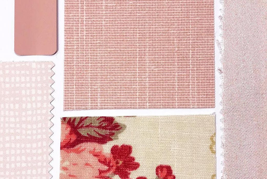
Pictured: Blinds.com Woven Wood Shades in Charleston White. Photo via @dreaming_of_decor.
1. Pink Can Open Doors
Millennial Pink has made it beyond the "trend" stage and some even say it's a new neutral! This year, Benjamin Moore named First Light, a soft pastel pink, as their color of the year. It's a friendly and welcoming which makes it the perfect front door color.
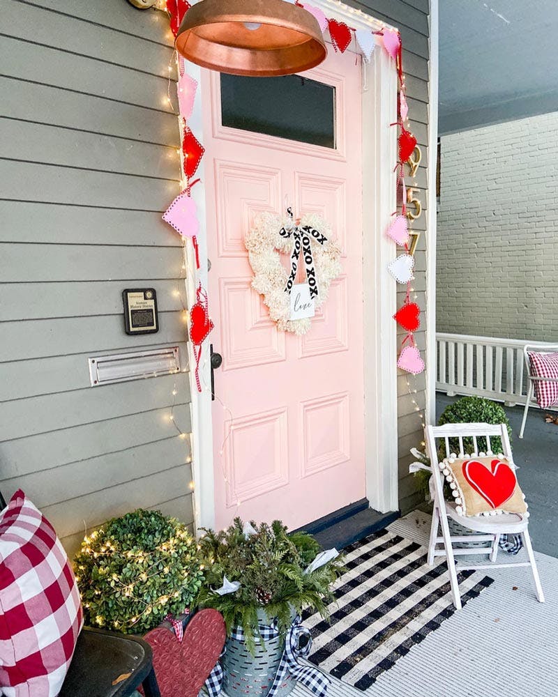
We're particularly in love with this door from @tatertotsandjello. Topping it off with red hearts and garland, it feels so cheerful and really pops against and otherwise neutral facade. Even after Valentine's Day has passed, her entry stays bright and inviting.
2. A 70s Mod Inspired Foyer
The 70s are back and we're MOD-ly in love with this foyer from @therathproject. The pinks and reds from the wall art and benches really catch your eye against all the cool retro green. She keeps the space modern with the black trim while the glossy finish mirrors the drama from the marble tile. Plus the attention to details has us blown away: notice the subtle red picture frame, wood baseboard trim and art deco light fixture.
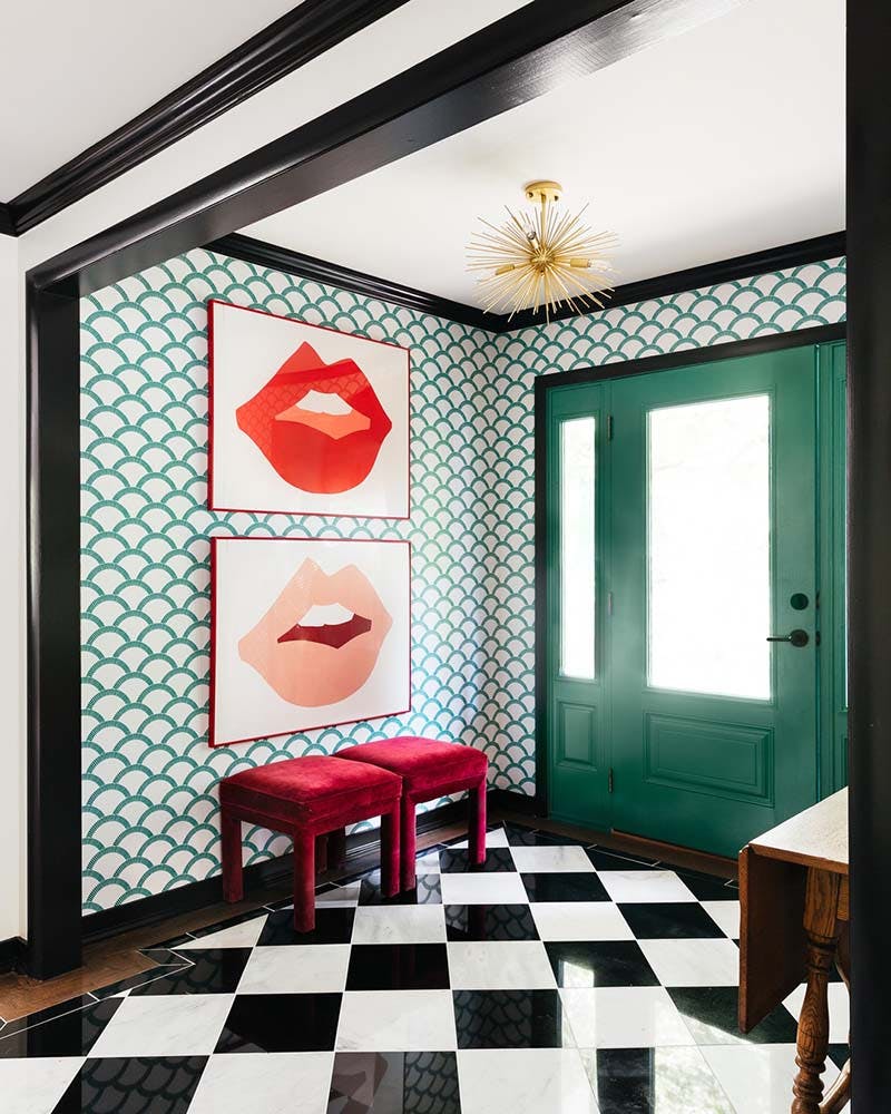
Image used with permission via @therathproject.
What makes these colors really pop is the natural light streaming through the door and sidelights. However, with lots of light can come privacy concerns. If you need to cover your foyer windows, we recommend sticking with something light filtering like a roller shade.
3. Pink Shades For A Sweet Studio
Window treatments can be an easy way to add color to your space without it feeling overpowering. Ashley from Sugar and Cloth chose the Premium Light Filtering Shades in Dusty Rose for her renovated studio's windows. This color perfectly matches her office's bright pink doors.
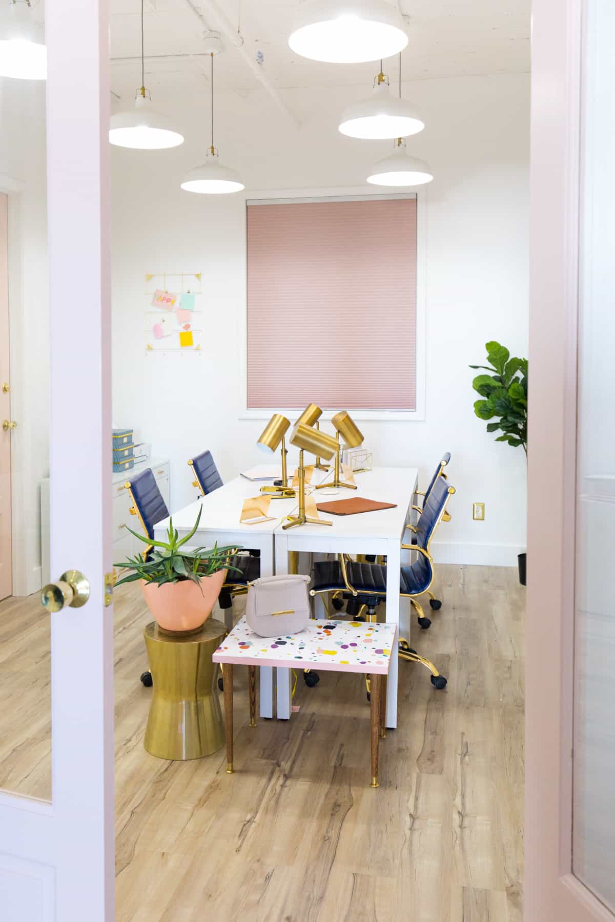
Image used with permission via @sugarandcloth.
Cellular shades come in hundreds of colors so it's easy to find the perfect shade (pun intended) to match your space. They have the added bonus of insulating the industrial space's large windows against the Texas heat.
4. Color Blocking Is Here To Stay
Color blocking means sectioning a space or item into chunks or "blocks" of color. Often these colors are bold, saturated and high contrast. One of our favorite examples comes from @houselarsbuilt. You absolutely have to see the before shots of this guest room transformation.
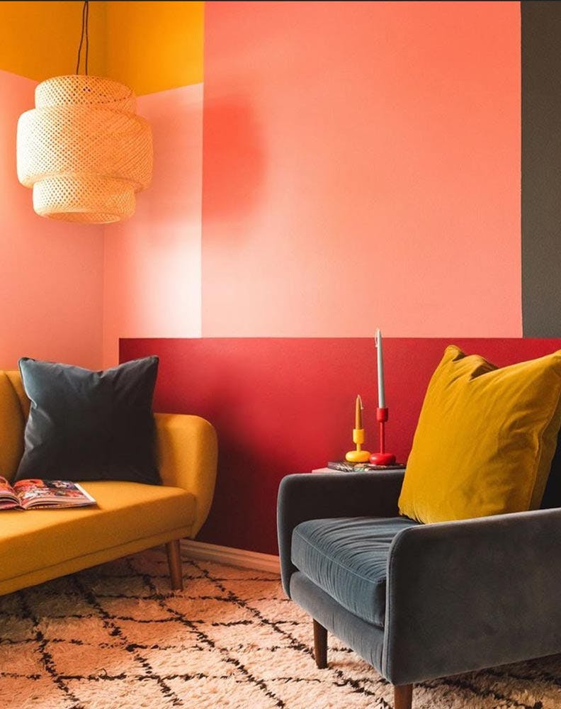
Image used with permission via @houselarsbuilt.
The light reflecting off these rosy walls is warm and comforting. Tempered with just a bit of mustard yellow and grounded with a cool charcoal grey for contrast, this room certainly is a fun place to hang out.
Try the color blocking trend on your windows with a Roman or Roller Shade.
5. Draperies: A Home Theater Classic
What's more of a theater classic than billowing red draperies? Draperies are one of the best window treatments for living rooms or home theaters. They're also a great solution for renters who may not be able to paint but still want to bring a bit of color to their home.
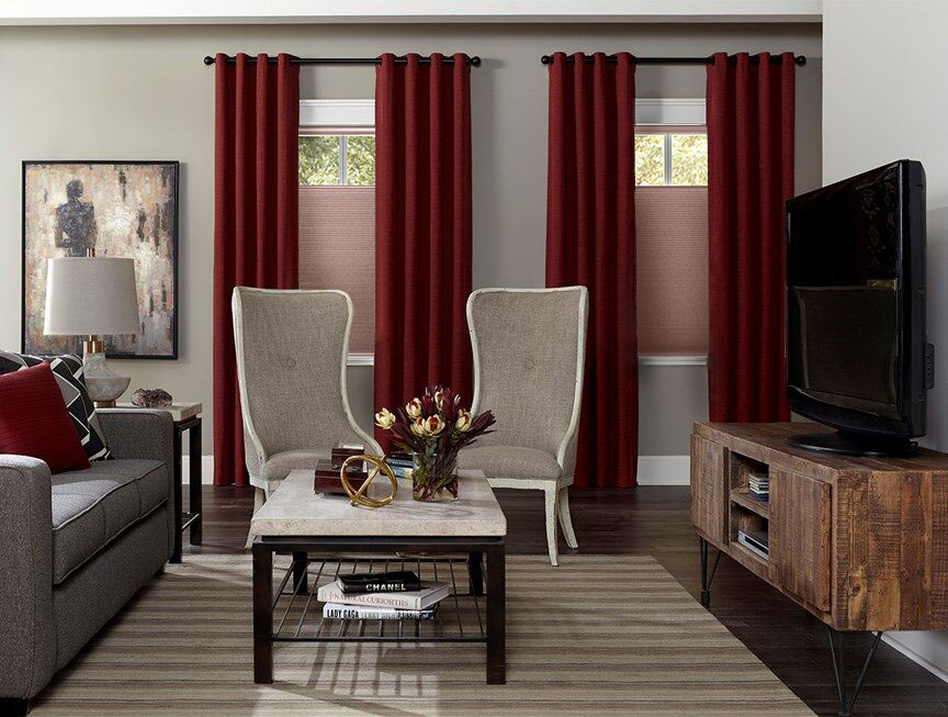
The Easy Grommet Drapery in Brisbane Red Pepper mimics the grandeur of those gorgeous draperies seen in historic theaters. It's classic, regal and inviting. Draperies elevate your look when layered over another window treatment like cellular shades.
6. Modern Entryway with A Splash of Color
Dark trim and furniture make pink accents feel upscale and sophisticated. Choosing a colored window treatment can be a really interesting way to add color to an otherwise neutral space.
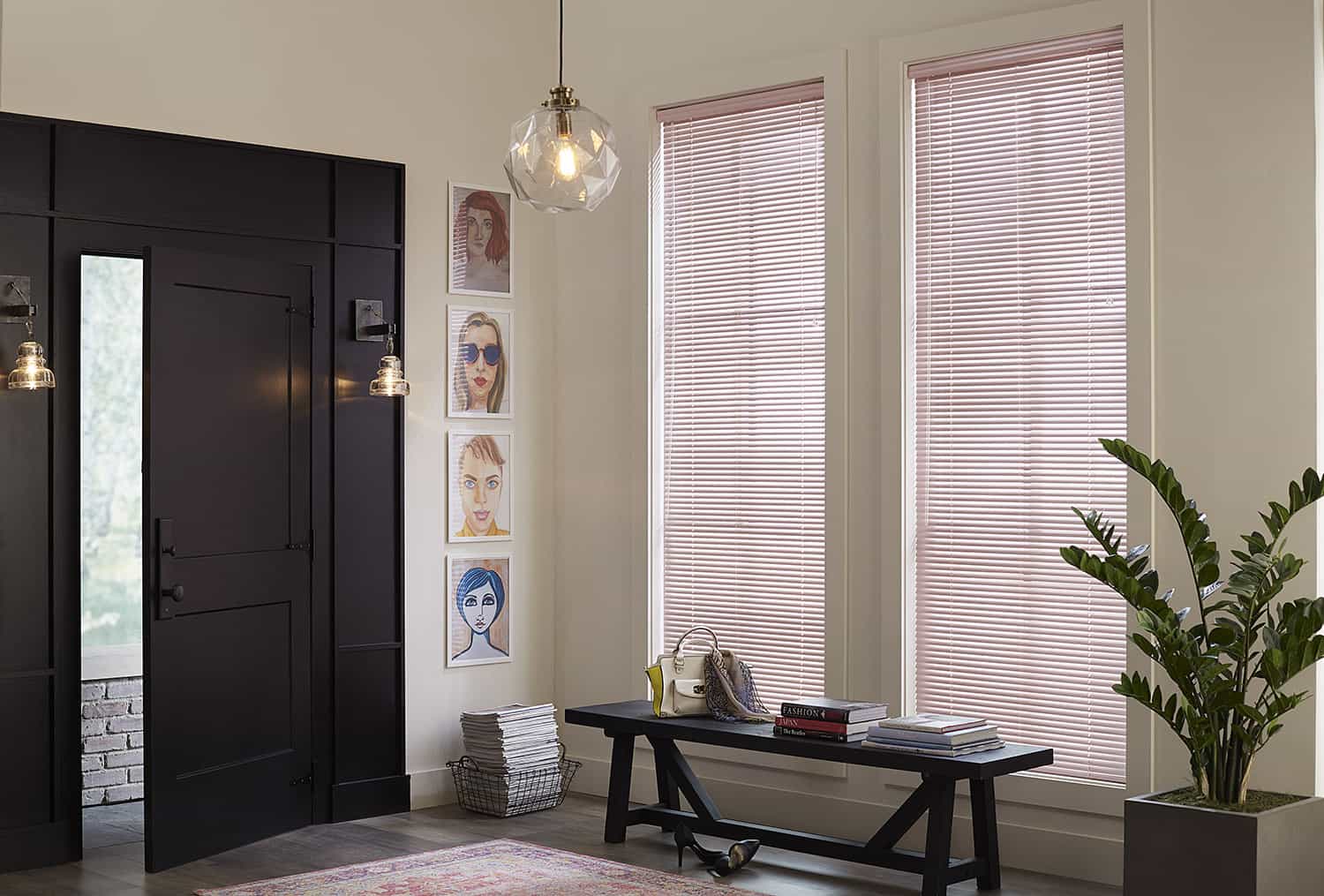
Pictured here are the Blinds.com 1" Mini Blinds in Pale Pink. Aluminum mini blinds are super modern and come in a variety of colors. They're also super durable which is great for high traffic areas like an entryway.
7. A Powder Room That's Tickled Pink
When you think of wallpaper, are you picturing gingham borders with chickens and farmhouse motifs? Good news, wallpaper has gotten a major update since grandma's day. This playful powder room from @takethecannoli stopped us in our tracks when we first saw it.
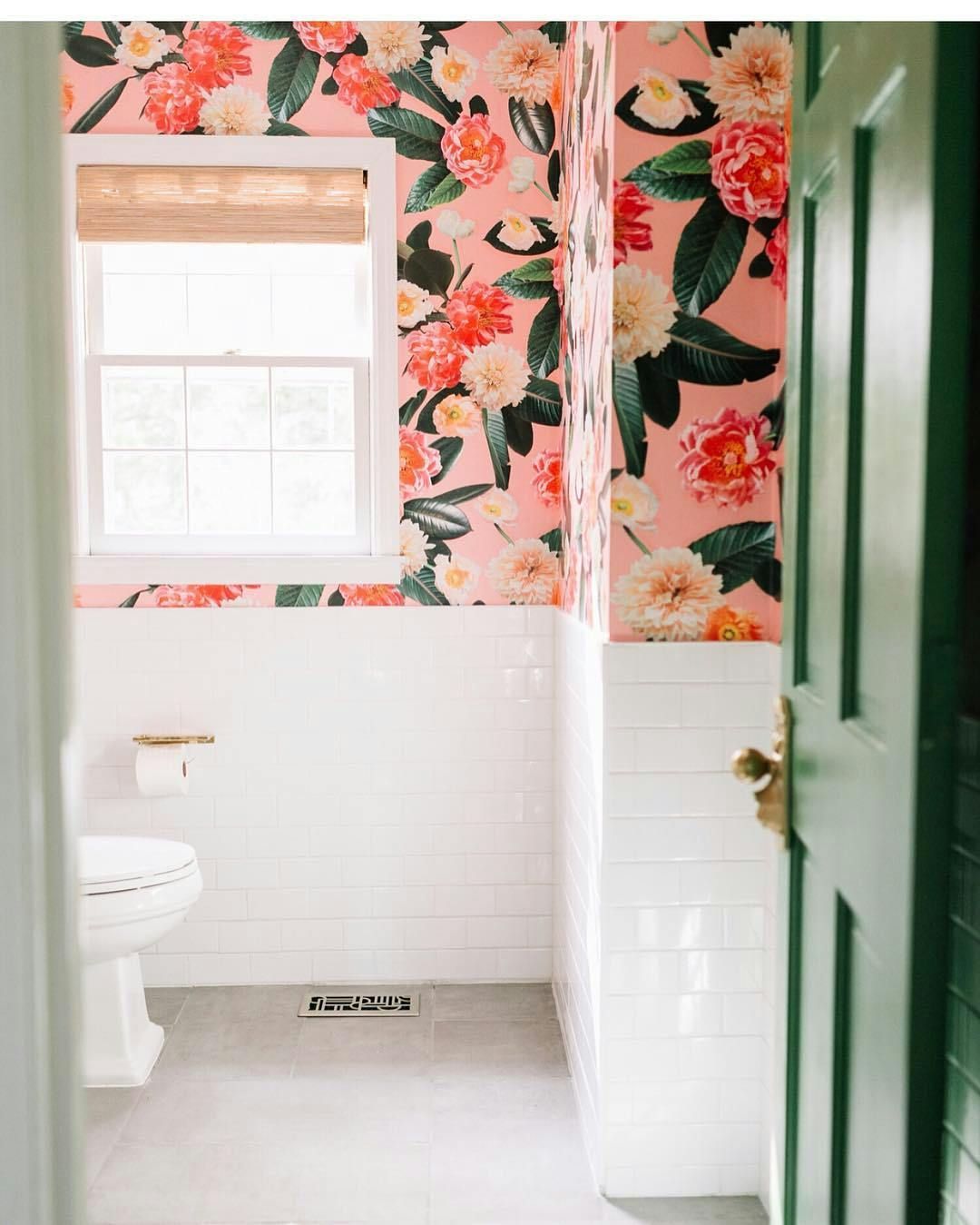
Image used with permission via @takethecannoli.
We love this bold wallaper and how the Blinds.com Designer Woven Wood Shade adds a pop of texture. The color, Caribbean Straw, picks up on all the gold accents and really amplifies the vintage-inspired ambiance.
8. Wrapped Up In This Pink Kitchen
This ribbon tutorial from @studiodiy is a holiday home tradition for her but we're in love with it for Valentines Day too! Plus what's not to love about these pink cabinets?
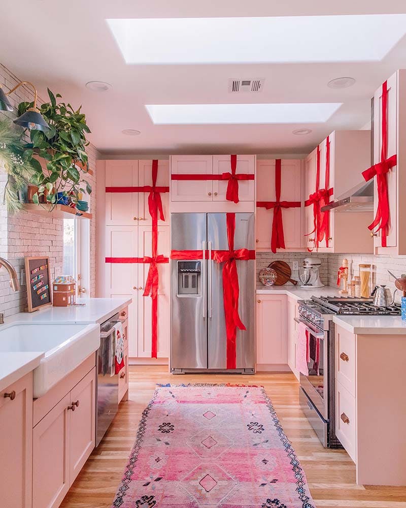
Image used with permission via @studiodiy
Choosing pink cabinets is an unexpected twist. Keeping it a pastel shade prevents the color from feeling overwhelming when so much surface area is covered. It's light enough to reflect light from her windows and skylights really well keeping the kitchen bright and welcoming. The red bows are a festive touch nearly year-round.
Need Color Advice?
Our Design Consultants can help send you free color samples or be a sounding board for your questions! Their help is complimentary and it never hurts to have a second set of eyes review your order. Give us a call 7 days a week: 844-551-3769.