
We're counting down the days left in the year and we know many people are eager to find a breath of fresh air in 2021. A lot of people gave their homes makeovers this year to create a more comfortable space to recharge. Using color might be one of the easiest ways to transform how a space feels. So we're rounding up the biggest color trend forecasts for 2021 as well as some tips on how to bring these colors into your own home.
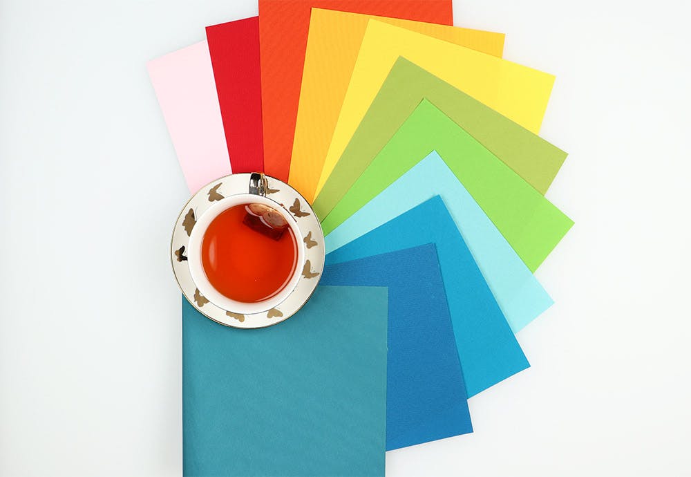
Pictured: Blinds.com Economy Blackout Roller Shades. Also available in Light Filtering or Solar opacities.
Benjamin Moore: Aegean Teal
Named after the Aegean sea, this teal evokes the feeling of a seaside Mediterranean spa. If you're looking to make your space feel more serene, this is definitely a color to consider!
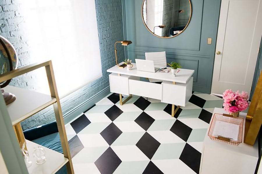
Pictured: Blinds.com Solar Roller Shades in Monterrey 5% Cloud White. Photo via @houselarsbuilt.
If you love this color but slathering it over every wall feels too overwhelming for your taste, a window treatment might be the perfect compromise!
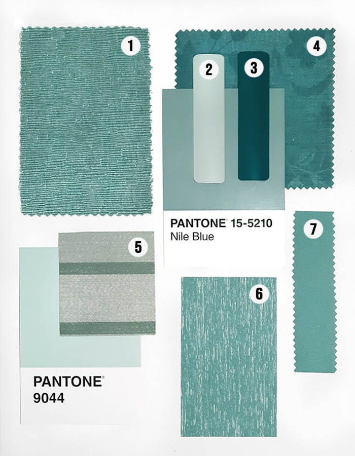
Pictured: 1. Tantalum Sea Foam, 2. Agave, 3. Malachite, 4. Verdant Sea Glass, 5. Carrollton Stripe Agave, 6. Shantung Topaz, 7. Carousel Topaz
This color also works nicely with light neutrals like beige or gray and it really pops next to white. Pairing with a neutral can help tone down the color's intensity too.
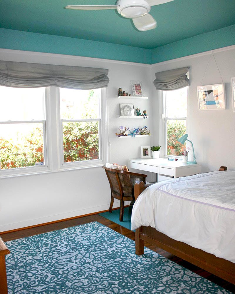
Pictured: Blinds.com Roman Shades in Newport Grey. Photo via @jaccardinteriors.
Glidden: Aqua Fiesta
Similar to Behr, Glidden nominated a soothing (but cheerful) aqua color as their color of the year. It is a few shades lighter than Aegean Teal.
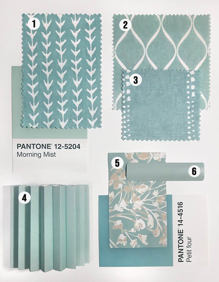
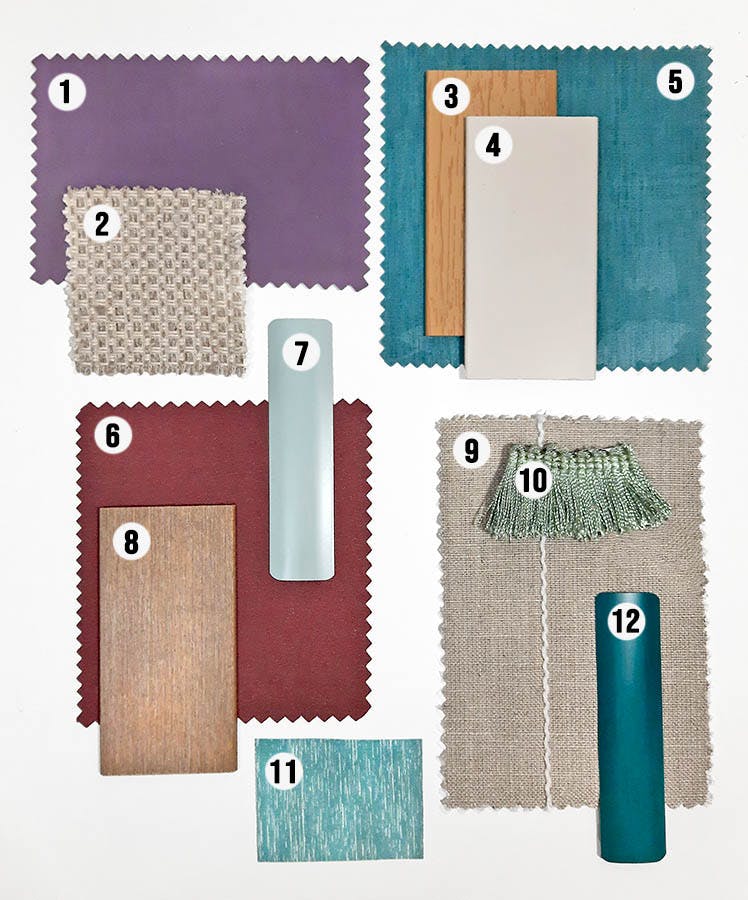
Pictured: 1. Ivy Seaglass, 2. Profile Dockside, 3. Darien Seaglass, 4. Halo Blue Lagoon, 5. Nature's Bouquet Sky, 6. Agave
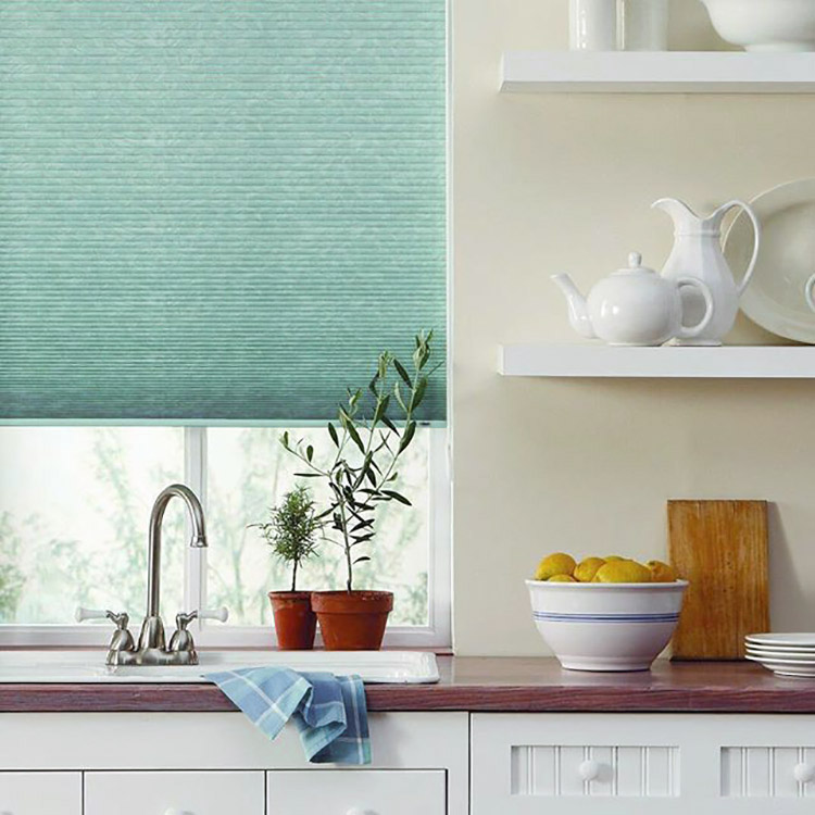
Pictured: Bali Light Filtering Cellular Shades in Halo Blue Lagoon.
Cellular shades, like Bali's Light Filtering Cellular Shade in Halo Blue Lagoon, are a great way to incorporate a sweet pop of color in an otherwise neutral room without the commitment of paint.
Sherwin Williams: Urbane Bronze
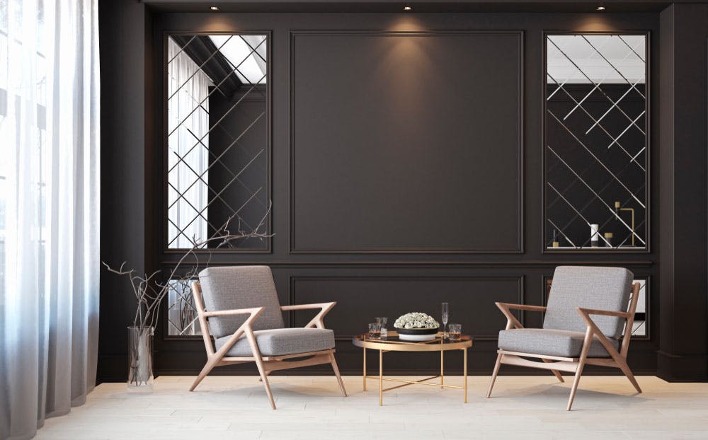
Sherwin Williams went for bold and dramatic when choosing Urbane Bronze as their color of the year. This smoky charcoal has warm undertones that give it the appeal of oil rubbed bronze and helps a room feel more grounded.
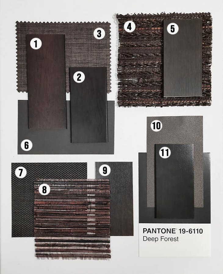
Pictured: 1. Rustica Burnt Umber, 2. Realgrain Dark Walnut, 3. Tundra Blackout Russet, 4. Papua Clove, 5. Chocolate Lava, 6. Splendor Chocolate, 7. Sydney 5% Bronze, 8. Lyra Chocolate, 9. Sienna Mahogany, 10. Carousel Umber, 11. Dark Walnut
This is a very easy color to incorporate into your home and windows since it is basically a neutral (yes, black is a neutral!). Great news if you're shopping for window treatments since this color looks great on wood blinds, woven wood shades, shutters and even some faux wood blinds.
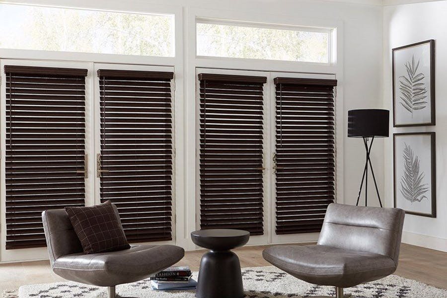
Pictured: Blinds.com Cordless 2 1/2" Faux Wood Blind in Espresso.
Sherwin Williams also partnered with HGTV on a 2021 colors collection with a deep burgundy, called Passionate, being the star. We expect to see a lot of variations on this color in 2021, from maroon to plum and terra cotta.
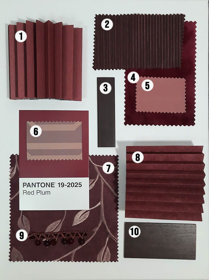
Pictured: 1. Spiced Raisin, 2. Cotillon Merlot, 3. Mahogany, 4. Luxe Velvet Cabernet, 5. Spectrum Azalea, 6. Deco Persimmon, 7. Hasting, Plum, 8. Hideaway Red Velvet, 9. Toffee Crystal Trim, 10. Red Mahogany
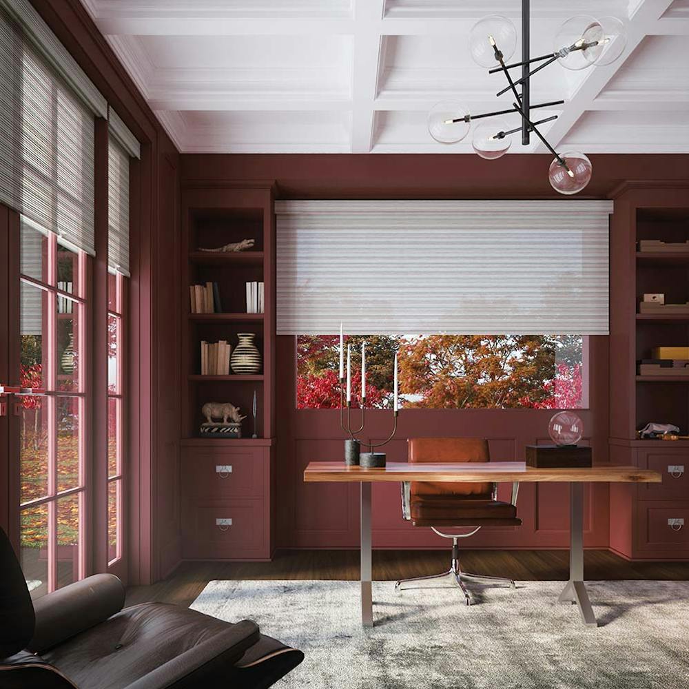
Pictured: Levolor Light Filtering Roller Shades in Batten Multi.
Earthy reds work well with white or off white window treatments, like roller shades (above). Or try wood or faux wood blinds if you're going for a high-contrast look. You can also try a medium or light woven wood shade (below) to add more texture and character to a space.
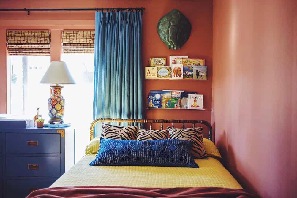
Pictured: Blinds.com Woven Wood Shades in Driftwood Umber from @ClaireBrodyShop.
Behr: Elevate Your Comfort Zone Palette
Breaking from the pack, Behr opted to present a palette of 21 colors they think will be prominent in 2021 under the theme of comfort.
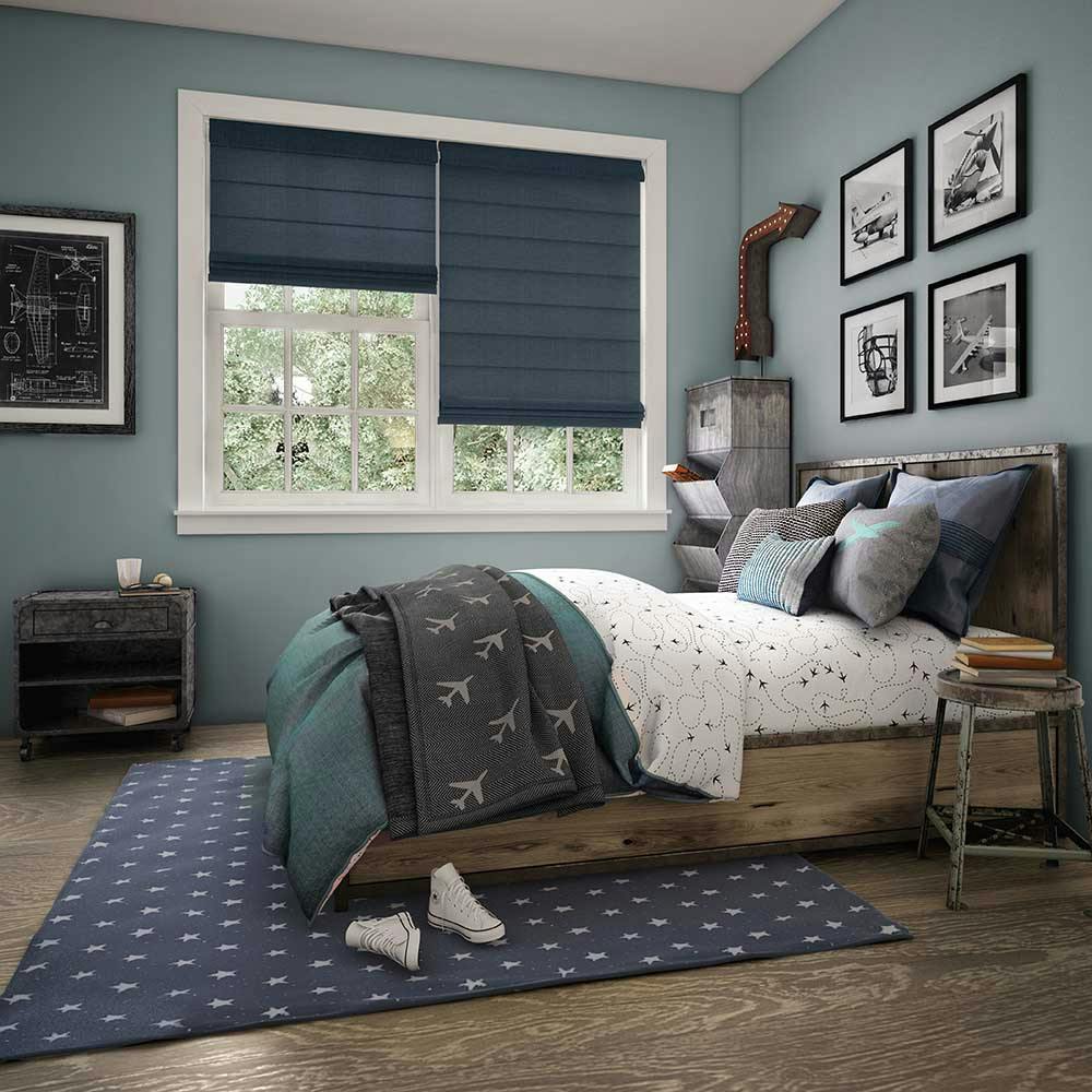
Pictured: Levolor Roman Shades in Designer Textures Blue.
The collection of 21 colors promotes relaxation and comfort after such a challenging year. It includes colors like Smoky White, Almond Wisp, Saffron Strands, Royal Orchard Green and Voyage Blue.
Pantone: Ultimate Gray and Illuminating Yellow
Pantone's colors of the year were announced on 12/9, Ultimate Grey and Illuminating Yellow. And the world had mixed feelings about it. A grey, really? But the meaning behind these two colors goes much deeper below the surface.
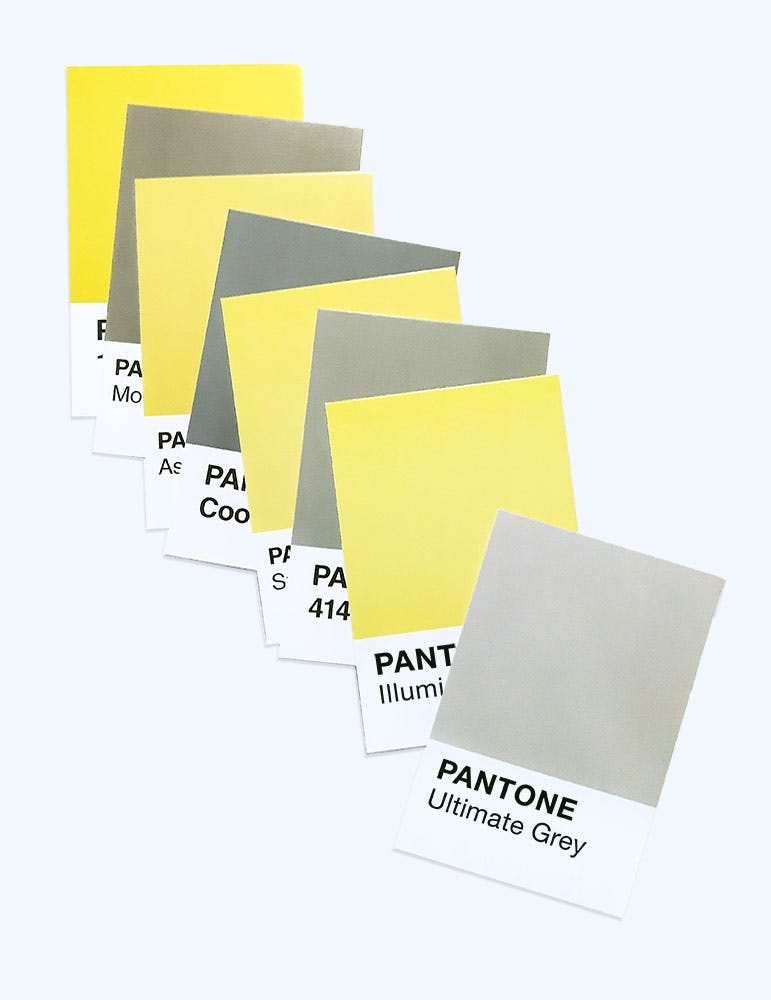
Pantone calls these colors thoughtful + forward thinking. Strength + Hope. Practical + Optimistic. Together these colors show there is light at the end of the tunnel.
Ultimate Gray has been a popular neutral in home décor for over a decade but pairing it with yellow, which psychology often associates with happiness, brings a ray of sunshine to any room. It works perfectly on Roman Shades or Draperies it amplifies warm and sunny ambience.
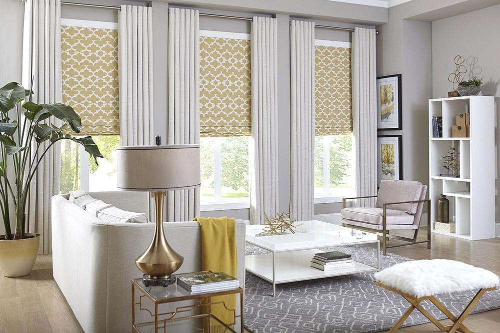
Pictured: Blinds.com Premium Roman Shades in Casablanca Sun and Blinds.com Easy Grommet Drapery in Brisbane Sand Dollar.
Illuminating yellow fits right in with other pastels and the resurgence of postmodern décor trends. Some even speculate this Gen Z yellow will soon overthrow millennial pink.
What Do You Think?
How do you feel about 2021's colors of the year? Do you love them or would you have chosen something different? Join the discussion over on our Instagram @blindsdotcom. Also be sure to follow us on Pinterest for more color and décor trend inspiration!
Have window treatment color questions or want a color consult? Our Design Consultants are on standby, ready to help! Give us a call: 800-505-1905.

